
Throughout our daily lives we are constantly surrounded by different colours, whether it is the colour of the office that we work in, the colour of the mug that we drink from or the colour of our bedroom walls; colour is everywhere and it can have a direct affect on our mood and emotions. As a result, we want to explore how different colours affect our mood and which colours in particular we can incorporate into our daily lives to evoke a sense of calm.
Firstly, let’s explore how and why colour affects our mood. Colour can have a powerful impact on our mood and emotions due to its ability to influence our physiological responses. According to scientific research, there is a physiological mechanism in our brains which allows colour and light to send signals through our bodies which affects our mood, heart rate, alertness, blood pressure, stress levels, and even hormone production. It is important to note however, that the impact of these colours is also related to our individual cultural and personal associations.
For example, bright and bold colours such as red, orange and yellow are often associated with energy, warmth and positivity but can also evoke a sense of danger and urgency depending on your own associations to the colour. Alternatively, cooler colours such as blues and greens are known to be linked to calmness, serenity and relaxation. This extends to our emotional response to colour. Colour theory explores how different colours can trigger physiological responses in our bodies, which in turn affect our emotions. For instance, exposure to bright, and warm colours can stimulate the release of adrenaline and increase heart rate, leading to heightened excitement. In contrast, cool colours can slow down heart rate and induce a sense of relaxation.
So how can we create a calming environment using colour?
When we think about creating a calming environment, the first place that comes to mind is the bedroom to create a space that encourages relaxation and sleep. In order to achieve a calming environment it is important to think about colours which are associated with tranquility. Choosing soothing colour combinations is a good way to do this. Complementary colour schemes (colours opposite each other on the colour wheel, like blue and orange) can create dynamic and visually stimulating environments, while analogous colour schemes (colours adjacent to each other on the colour wheel, like blue and green) can create harmonious and soothing settings.
The context in which colours are used matters as well. For example, a bright red bedroom might be invigorating during the day but overly stimulating for sleep at night. Similarly, the same colour might have different effects in different settings, such as a lively restaurant versus a calm spa.
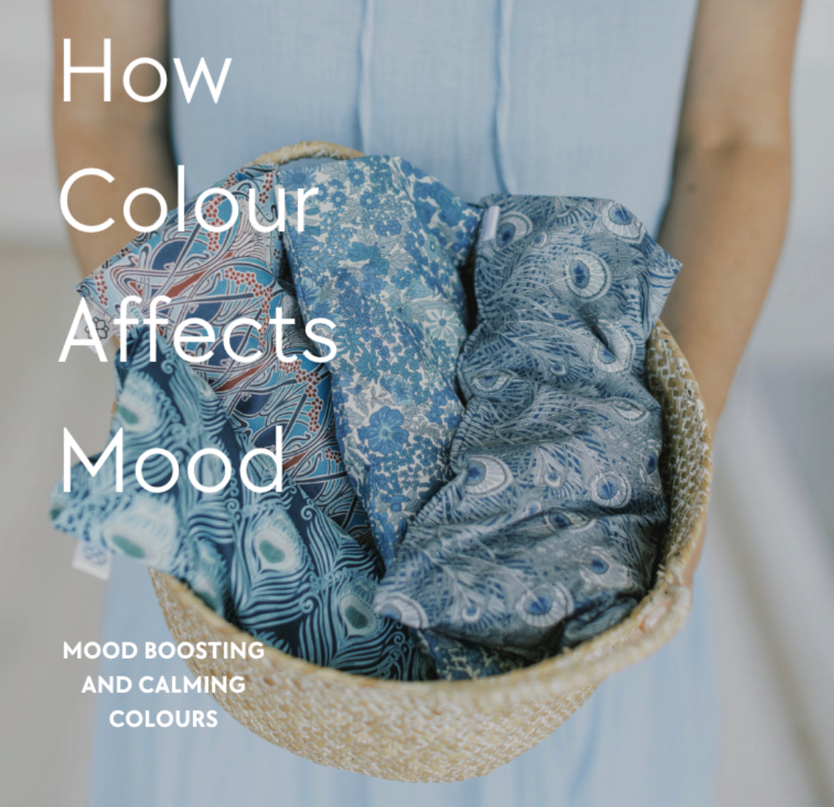
One way to enhance your bedroom with colour is by adding sleep accessories in calming colours. For example, the Spritz Wellness Aromatherapy Eye Pillows are crafted in calming Liberty London fabric designs so that they bend into a tranquil sleep environment. Our Hera Blue Aromatherapy Eye Pillow has a harmonious design using a combination of shades of blue and a feather pattern inspired by nature to evoke a sense of calm. The duration and intensity of exposure to a colour can also influence mood. Prolonged exposure to a subtle and muted colour can have a more soothing effect so by meditating with an Aromatherapy Eye Pillow or even using an Aromatherapy Wheat Bag on aches and pains can enhance relaxation when crafted using a soothing colour palette.

Colours that promote a sense of calm, relaxation, and tranquility are generally considered conducive to better sleep. Here are some colours that can help create a soothing environment in your bedroom.
Blue: Light shades of blue are often associated with calmness and serenity, making them a good choice for promoting relaxation and sleep. Blue has been shown to lower heart rate and reduce anxiety, contributing to a peaceful atmosphere.
Green: Soft shades of green can evoke feelings of nature and balance, which can help create a soothing environment for sleep. Green is also known to have a calming effect on the mind.
Lavender: Lavender can contribute to a tranquil atmosphere and may help induce a sense of calm before sleep due to it’s links to aromatherapy.
Grey: Light grey shades can create a sense of neutrality and calmness, providing a soothing backdrop for relaxation and sleep.
Beige: Similar to grey, beige is a neutral colour that can create a serene and peaceful ambiance in a bedroom.
Let’s talk mood-boosting colours:
It’s important to incorporate some mood-boosting colours into your daily life as well as calming and tranquil ones; it’s all about balance. One way to incorporate mood-boosting colours into your daily routine and home is through accessories such as throws, pillows and decorative objets that you can add to your home combined with a backdrop of more subtle and soothing tones. For example by adding the Spritz Wellness Wild Flowers Eye Mask to your bedside table you are incorporating bright and bold colours in a subtle way. The floral design also connects to nature to evoke positive feelings connected to the outdoors.

While incorporating mood-boosting colours, be mindful of how they interact with the existing colours in your home to create a harmonious and cohesive look. Experiment with different colour combinations until you find the ones that uplift your spirits and create a positive atmosphere that induces sleep and also evokes positive emotions.


